happy 2012 and welcome back to the ZINC sense blog.  we’re going to kick the year off right now with the january project(s) of the month:  frozen music-the stephen hawking centre at the perimeter institute for theoretical physics.  

if you are ever in toronto, ontario, with a day to kill, you may want to drive to the community of waterloo.  there is plenty to see (and do) in toronto, but waterloo may take you on a visual journey that is rare in an age where communities everywhere are trying their hand at the architectural-icon-as-attraction-idea

once in waterloo, drive to the centre, located along the banks of a meandering river- specifically at 31 caroline street north.  it will take you a little while to get there from toronto (depending on your driving habits), but the drive will be worth it if you would like to see not one, but two incredible buildings connected by the talents of two amazing firms.

the arch daily website has an incredible spread on the first part of this building.  it was designed by the powerhouse firm saucier and perrotte architects.  (http://www.saucierperrotte.com/ and the arch daily link is located at: http://www.archdaily.com/12293/perimeter-institute-for-theoretical-physics-saucier-perrotte-architectes/). the design sensibility is pure mastery of form followed by striking details -all rendered with the rarest of architectural qualities; restraint.  not to oversell this firm, but saucier and perrotte have this touch that lies somewhere between poetic massing that approaches the monolithic, and a dozen Dixon Ticonderoga # 2 pencils. 

teeple architects designed the second part of the centre.  do yourself a favor and check out the washed out image of the centre on their site at  http://www.teeplearch.com/.  the images above are of the teeple addition to the perimeter institute.  all four are from old vm friend, gilbertson photography.  (www.gilbertsonphotography.com)  the panels are flatlock panels in quartz zinc, and were installed by the craftspeople at flynn canada.  (www.flynn.ca

whereas saucier and perrotte celebrate the work in a quiet manner, teeple architects also celebrate the detail -the normally quiet or the small moves, if you will, within the larger massing of the addition.  only they do it with the exuberance of a howitzer.  everywhere one looks at this addition, the joy, the simplicity of the moves, is celebrated and served in suprise after closer-inspection-surprise.  the joy is in the looking.  and then looking again.  the lines invite the eyes to explore, move, dance, twist, jump, and finally rest.  what could have easily been a heavy, heavy hand has managed to recognize the significant, and has given it form.

we can, and probably should, go on and on and on about all of the other cool people and cool details involved with and in this project.  all of that and the work of the institute, and the teaching that takes place there, and the mood and vibe of the intellect that oozes out of every corner and crevice of the centre.  we could talk about the history of the institute and how it is indirectly tied to the pioneers of the smart phone.  we could talk about all of that and more.   but we won’t.  at least not during this initial design salvo shooting across a northern sky.  instead, we invite you to drive up there and stop and look for yourself.  perhaps call in advance.  why?

because this is a building composed of two buildings.  forgive the weak poetic license and the waxing poetic, this building (these buildings) bring it out -in droves.  like the ying and yang, or any other symbol that has a visual balance, the two parts of the centre work together while maintaining their own identities. all of that and because it is worth it. 

enjoy. -vm

Source: www.zincsense.com

repost from www.zincsense.com

Located next to the International Airport of Miami, Park Square at Doral is one of the first views passengers have upon arrival in Miami. A suburb of Miami, Park Square at Doral is situated on the site of a former logistics warehouse. Fifty percent of the property was allocated for mixed-use and high density building and the other fifty percent for a new townhouse community and major park.

Source: gkdnews.com

Repost from the GKD pressroom

Such interesting response from Paul Bieber in his blog regarding the tempered glass manufacturers. This point of view from a glass expert, it makes to think it over in which way this business could improve their service.

In the following lines, you may read an extract of this point of view published last october 2011.

Question: Lately, I can’t seem to get glass tempered correctly from my fabricators. Even tough fabricators seem to be slow, they can’t get my orders right and delivered on time. What can I do?

Response: Thanks for your note. You are not alone in this feeling. I have talked with many shop owners and most feel the same way. It seems that with pricing so low, most fabricators have reduced their labor force to bare bones, often keeping the lowest paid workers.And you get what you pay for.

What can you do?

-Understand fully your fabricator’s tolerance level. You may be expecting glass that is a higher quality than they can produce. All fabricators will meet the ASTM C1048 specs, but some do a better job. Compare their written spec sheets. Some fabricators will be better for high volume work, while others specialize in furniture quality.

-Tempered glass has distorsion based on the direction going into the oven. Specify if the roller wave should be parallel with the height or width. If the glass height is larger than the oven’s width, the glass can only be tempered in one direction.

-Order heat strengthened glass even when you don’t need to meet codes. HS glass cools slower than fully tempered and develops less warp.

-Try to avoid long, skinny pieces of tempered. They always come out looking poorly. The largest ratio for good glass should be 12:1, length to width.

-Thin glass warps more than thick.

-Ground or polished edge glass will always look better than seamed edges.

-Heat treating glass with soft-coat low-E is an art. Make sure your vendor is certified by the float manufacturer to treat its low-E products.

-Tempered laminated glass is a pain in-the neck to produce. Order heat strengthened laminated whenever you can (I may introduce the comment regarding this point, nowadays there are such a excellent results in terms of quality)

-Make sure your purchase order and drawings can easily be read. The most common mistakes are misinterpretacions from your order.

-Avoid calling in orders. Use email to prevent misunderstandings.

By Paul Bieber has 30 years in the glass industry, including 21 years as the executive vice president of Floral Glass in Hauppauge (NYC). He retired in 2005. Nowadays he publishes articles in his blog at www.usgnn.com

Source: renatocilento.blogspot.com

repost from www.renatocilento.com

While working on a local project, we ran into the problem of how to detail doors with terracotta tiles attached to them. So I paid special attention to the detailing of the doors on the “Potsdamer Platz” in Berlin, Germany and The Brandhorst Museum in Munich. Both are magnificent NBK Terracotta projects.

4.1.jpg

4.2.jpg

4.3.jpg

4.4.jpg

4.5.jpg

4.jpg

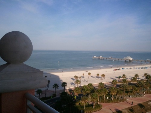
road trip:  (not really news, just an update on where we are)  part of the vmzinc team is in clearwater beach, florida -at least for another day or two.  we are attending the metal construction association annual meeting.  (www.metalconstruction.org)  we are also one of the sponsors for the event. 

this is a good meeting with relevant information and a healthy exchange of ideas.  sponsors, business partners, associates and even the competition attend, learn, laugh and discuss the industry.  business gets done and attendees can learn about the state of the market -a worthwhile endeavor in and of itself.  of course, it helps that it is being held in a non-winter-like location, too. not surprisingly, attendendance is up this year.  we’ll keep you posted. -vm

Source: www.zincsense.com

repost from www.zincsense.com

One of the problems designers come across is how to integrate Diffusers into the ceilings system. The idea here is to integrate the Diffuser as much as possible so that they are not the main focus on the ceiling. Ceilings Plus offers a great solution on how to integrate the diffusers into their Illusion ceilings panels. For more information visit http://tiny.cc/muml2

3.1.jpg

3.2.jpg

3.3.jpg

3.4.jpg

3.5.jpg

3.6.jpg

3.jpg

It has been recently exposed in the Fad Gallery (Barcelona) such a singular glass pane, designed by the prominent architectural firm Rafael de La-Hoz for a Hospital in Móstoles (Madrid). 
 
The building has a rainscreen facade formed by around one thousand romboidal bubble glass units.
Cricursa has been selected to manufacture the glass panels, also giving technical support during the design process done by the architectural team.
The geometry is a double bending, first in one of the axis of the romboid, and secondly a spherical shape  sited at the centre of the pane with around 400 mm of deflection.
Glass measures are 4900 mm width, 3360 mm height and 12 mm thickness. 
 
The composition is formed by low iron glass, with screen-printed in white with a particular pattern, achieving privacy and solar protection.
Curved annealed glass technology offers versatility and opens up to endless structural possibilities.
Photos courtesy by Marketing Cricursa

Source: renatocilento.blogspot.com

Repost from the GKD pressroom

Annette Strauss Artist Square, is part of the Dallas Art district and designed by Foster + Partners with Good Fulton & Farrell Architects as the architect of record. Named for the late former mayor of Dallas, Strauss Square will host a variety of outdoor events ranging from concerts to theatrical and dance performances to multi-day festivals and will accommodate audiences of up to 5,000 in open-air setting. The panels shown in the pictures below are VM Zinc / Alpolic composite panels. More here: http://tiny.cc/65g9u

2.1.jpg

2.jpg

Think Zinc

Zinc as a building material has found acceptance and it’s place on many projects in North America. The durability, flexibility, and malleability of this metal makes it a great material to enhance and expand the creativity of the architects utilizing it in their designs. More here:http://tiny.cc/d9hi9

1.jpg

1.2.jpg

1.4.jpg

1.3.jpg