Uncategorized

poetic zinc

poetic zinc:

check out this sweet article link from this month’s architectural record. (click on poetic zinc above)  if we had more time and talent, we would come up with some basho-esque haiku.  for now, we will only say, “five, seven, five.”  or, perhaps,

“the windy city. 

intersection construction. 

one sa-weet(!) building.” 

um… then again, we may want to leave haiku to basho and others.  we’ll just enjoy the visual tranquility, and almost zen-like state, of this project by john ronan architects (http://www.jrarch.com/).  enjoy.  -vm

Source: www.zincsense.com

repost from www.zincsense.com

green friends:  our friends at dri-design (www.dri-design.com) were recently featured on the bdc network’s green zone.  check out their sweet videos (plural) in the lower right hand corner of the screen.  after you watch the first building (filmed at green build) click on the next video to see how fast this material goes up.  it’s pretty amazing and nice to see a product that is designed for efficiency as well as aesthetics.  here’s the link:  http://www.bdcnetwork.com/greenzone/dri-design.html  enjoy. -vm

Source: www.zincsense.com

repost from www.zincsense.com

thankful california-11-11 project of the month:  we almost missed the end of the month without our regular project of the month feature.  we are in toronto this week for the construct canada show.  (www.constructcanada.com).  so, before the month slips away (in about one hour) allow us to share this beautiful pigmento green zinc project with you. 

this is the temple sinai in oakland, california.  worth the drive if one is in the bay area, this beautiful project contrasts the existing temple with the new addition by michael harris architecture.  (http://www.mbh-arch.com/)  in addition, michael harris contrasts vertical and horizontal elements of the addition and echoes those moves in the orientation of the zinc standing seam panels. 

the project was installed by peterson sheet metal and the photography was shot by gilbertson photography. we are thankful to share it with you -this month.  enjoy. =vm

Source: www.zincsense.com

repost from www.zincsense.com

45 Park Lane in central London has been undergoing a remarkable transformation, including the addition of a Brise Soleil Solar Shading solution, manufactured and installed by Levolux. Designed by The Office of Thierry W Despont in New York, in collaboration with Paul Davis and Partners, 45 Park Lane is the latest property to be included in the luxury hotel group, Dorchester Collection, and is set to welcome its first guests this summer. It offers 46 luxury rooms, including a penthouse suite, all with stunning views over London’s Hyde Park, together with an ultra-chic bar and an American steak restaurant. more here:http://bit.ly/z4lSQ3

45-park-lane-hotel-01.jpg

45-park-lane-hotel-02.jpg

Last 20th of october I was invited by Tecnalia to give an speech in their headquarters for the Technical Conference: Perforated Sheet Metal for Enclosures and Architectural Meshes.
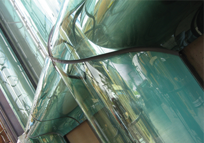
My speech was based upon the use of metallic meshes inside the laminated glass. I told the point of view of Cricursa, the company I actually work for, who has developed an important know-how within the field of laminates pushed by the requirements to manufacture laminated curved glass.
The facade business is steadily making progress by demands of Architects and Designers.
Glass is still the one and only transparent filling for curtain walls and interiors designs because it offers its versatility, through its compatibility with a range of materials and the possibility of being bent. Therefore, it helps making feasible complex geometries and designs.
In the following list, I describe the main technologies that can be used with curved and flat glass:
-Screen printing: the colour is baked during the tempering process, bonding it permanently to the glass.

-Colour interlayers: the combination of different colour layers of 0.38 mm PVB thick, creates a wide range of more than 600 colors.

-Solar control interlayer: high-technology solar control film is placed  between two layers of PVB, obtaining a high visible light transmission, in the meantime being controlled infrared solar energy.

-Ink-jet printig on interlayers, which enables the production of designs and photografic images in a laminated safety glass.

-Metallic meshes have been for the last decade in fashion in architecture, being considered by Dominique Perrault, who has enhanced the use of stainless steel in his most distingued projects.

-Plastic meshes has been threatening the place of the metallics, because of easiness to get laminated versus metallics and it requires less energy cost to manufacture. It is also manufactured from metal diposits that use the latest technological advances and provides solar control control and privacy functions, as well as unrivalled asthetic value.
In order to achieve the quality required in such a singular products, it is basic a long manufacture process to succeed with a final product.This process is required several testing until a suitable result is achieved.
This post is under construction and it may be under cosntruction for years, because it will always remains open.

Source: renatocilento.blogspot.com

repost from www.renatocilento.com

happy 2012 and welcome back to the ZINC sense blog.  we’re going to kick the year off right now with the january project(s) of the month:  frozen music-the stephen hawking centre at the perimeter institute for theoretical physics.  

if you are ever in toronto, ontario, with a day to kill, you may want to drive to the community of waterloo.  there is plenty to see (and do) in toronto, but waterloo may take you on a visual journey that is rare in an age where communities everywhere are trying their hand at the architectural-icon-as-attraction-idea

once in waterloo, drive to the centre, located along the banks of a meandering river- specifically at 31 caroline street north.  it will take you a little while to get there from toronto (depending on your driving habits), but the drive will be worth it if you would like to see not one, but two incredible buildings connected by the talents of two amazing firms.

the arch daily website has an incredible spread on the first part of this building.  it was designed by the powerhouse firm saucier and perrotte architects.  (http://www.saucierperrotte.com/ and the arch daily link is located at: http://www.archdaily.com/12293/perimeter-institute-for-theoretical-physics-saucier-perrotte-architectes/). the design sensibility is pure mastery of form followed by striking details -all rendered with the rarest of architectural qualities; restraint.  not to oversell this firm, but saucier and perrotte have this touch that lies somewhere between poetic massing that approaches the monolithic, and a dozen Dixon Ticonderoga # 2 pencils. 

teeple architects designed the second part of the centre.  do yourself a favor and check out the washed out image of the centre on their site at  http://www.teeplearch.com/.  the images above are of the teeple addition to the perimeter institute.  all four are from old vm friend, gilbertson photography.  (www.gilbertsonphotography.com)  the panels are flatlock panels in quartz zinc, and were installed by the craftspeople at flynn canada.  (www.flynn.ca

whereas saucier and perrotte celebrate the work in a quiet manner, teeple architects also celebrate the detail -the normally quiet or the small moves, if you will, within the larger massing of the addition.  only they do it with the exuberance of a howitzer.  everywhere one looks at this addition, the joy, the simplicity of the moves, is celebrated and served in suprise after closer-inspection-surprise.  the joy is in the looking.  and then looking again.  the lines invite the eyes to explore, move, dance, twist, jump, and finally rest.  what could have easily been a heavy, heavy hand has managed to recognize the significant, and has given it form.

we can, and probably should, go on and on and on about all of the other cool people and cool details involved with and in this project.  all of that and the work of the institute, and the teaching that takes place there, and the mood and vibe of the intellect that oozes out of every corner and crevice of the centre.  we could talk about the history of the institute and how it is indirectly tied to the pioneers of the smart phone.  we could talk about all of that and more.   but we won’t.  at least not during this initial design salvo shooting across a northern sky.  instead, we invite you to drive up there and stop and look for yourself.  perhaps call in advance.  why?

because this is a building composed of two buildings.  forgive the weak poetic license and the waxing poetic, this building (these buildings) bring it out -in droves.  like the ying and yang, or any other symbol that has a visual balance, the two parts of the centre work together while maintaining their own identities. all of that and because it is worth it. 

enjoy. -vm

Source: www.zincsense.com

repost from www.zincsense.com

Windswept by Carl Sowers is simply amazing. Please take a minute and check it out. It is worth your time Oh yea the panels are from Hunter Douglas Facade….

Windswept from Charles Sowers on Vimeo.

Windswept is a wind-driven kinetic façade consisting of 612 freely-rotating directional arrows creating a large-scale observational instrument that reveals the complex interactions between the wind and the building. The wind arrows serve as discrete data points indicating the direction of local flow within the larger phenomenon.

Commissioned by the San Francisco Arts Commission for permanent installation at the Randal Museum, 199 Museum Way, San Francisco, CA 94114.

Created by Charles Sowers Studios.

charlessowers.com

Transparent, glazed facades overlooking a stunning wooded site are the hallmark of the new 24,500m² headquarters for Computer Sciences Corporation (CSC) at Aldershot, Hampshire. Solar shading that allowed an outward view was a prerequisite and Levolux was brought in to design, supply and install a bespoke brise-soleil based upon its Matrix louvre system. More here:http://bit.ly/ApT6P0

CSC_500.jpg